

Use 2,700K to 3,000K in every room people sit in, 3,500K to 4,000K where they work, and nothing above 4,000K anywhere anyone relaxes. That is the entire Kelvin answer and it is printed on every bulb packet in the store.
The number that decides whether the room looks right is the one beside it. Color temperature sets the mood; the color rendering index sets whether your walls, your wood and the people in the room come out the color they actually are. Most bulbs are sold on Kelvin and bought on price, and the rendering number is the one nobody reads.
Which Kelvin goes where
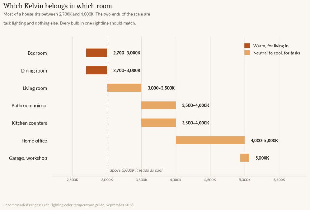
Kelvin measures how warm or cool the light looks, running from amber at the bottom of the scale to blue-white at the top. Cree, which manufactures LED lighting, publishes the room-by-room ranges most retailers repeat, and they are sensible enough to work from.
| Kelvin | Name on the packet | Where it belongs |
|---|---|---|
| 2,100K | Warm light | Reading nooks, accent lamps, anything late in the evening. |
| 2,700K | Soft white | Bedrooms and dining rooms. The default for most of a house. |
| 3,000K | Warm white | Bedrooms, dining, living rooms. Slightly crisper than 2,700K. |
| 3,500K | Bright white | Living rooms and bathrooms. The neutral middle. |
| 4,000K | Cool white | Kitchen counters, bathroom mirrors, work surfaces. |
| 5,000K | Daylight | Home offices, garages, workshops. Not living space. |
| 6,500K | Cool daylight | Inspection work. It does not belong in a house. |
Color temperature bands and their usual homes. Ranges published by Cree Lighting.
The practical shape of that table is narrower than it looks. Almost every fixture in a normal house should sit between 2,700K and 4,000K, and the top and bottom of the scale exist for jobs rather than rooms. If you are standing in an aisle deciding, 3,000K is the answer that is never actively wrong.
The mistake that looks worse than picking the wrong number
Mixing them. A kitchen at 4,000K opening onto a living room at 2,700K puts a visible temperature line across the floor, and the eye reads it as a fault rather than a decision. The same happens inside one room when three of the six recessed cans have been replaced over the years with whatever was in the cupboard.
Match every bulb you can see from one position. Getting a whole house onto one temperature matters much less than getting one sightline onto one temperature.
The number beside it, and the part of it they don’t print
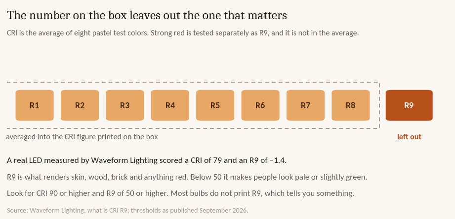
The color rendering index scores a bulb from 0 to 100 on how accurately it shows the colors of the things it lights. Cree recommends 90 or higher for any room you have spent money decorating, and that is a reasonable floor. Plenty of cheap LEDs sit at 80.
Here is the part that is not obvious. The CRI figure on the box is an average of eight test colors, R1 through R8, and all eight are soft pastels. Strong red is tested separately, as R9, and it is not included in the average.
Waveform Lighting, which sells high-rendering LEDs and publishes its measurements, documents an LED scoring a general CRI of 79 with an R9 of negative 1.4. The bulb passes as an ordinary 80 CRI product because the eight pastels carry it, while its ability to render red is effectively zero.
Red is not a niche color. It is the pigment under skin, the warmth in oak and walnut, the color of brick and terracotta and every wood floor in the house. A bulb with poor red rendering makes people look pale or faintly green, and it takes the life out of exactly the materials a decorated room is made of. Waveform puts a usable R9 at 50 or above, and 90 or above as excellent.
So the spec worth asking for is CRI 90 with R9 above 50. The catch is that almost no bulb prints its R9, and the manufacturers that do are the ones who have something to show. A packet that gives you CRI and nothing else has told you what it wanted to.
Kelvin and your paint are the same decision
A paint color and a bulb are two halves of one result, and choosing them in separate shops is why so many rooms disappoint after the painter leaves.
A north-facing room already receives cool, indirect daylight. Put 4,000K bulbs in it and the cool light in the room doubles up, which is how a warm greige on the chip ends up reading gray on the wall. That room wants 2,700K, and the warmer light does more for it than a warmer paint would.
The reverse is true of a room with strong afternoon sun. Warm daylight plus 2,700K can push a cream wall toward yellow, and 3,000K or 3,500K holds it steadier.
This is also the right order to work in. Fix the quantity of light first, then the temperature, then choose the paint. A sample board viewed under the bulbs you are actually going to live with tells you something. A chip held up in the store does not.
Bedrooms, and what happens after dark
The bedroom recommendation of 2,700K to 3,000K is usually explained as mood, and there is research behind it worth knowing.
Harvard Health reports a study comparing 6.5 hours of exposure to blue light against green light of comparable brightness. Blue suppressed melatonin for about twice as long and shifted circadian rhythms by three hours against green light’s one and a half. A separate finding in the same coverage is that as little as eight lux, which is dimmer than most nightlights, is enough to have an effect.
Cooler bulbs carry more blue. That is what higher Kelvin means. It is why the advice for a bedroom lands at the warm end of the scale and why the honest version of it is about your evening rather than about ambience.
The practical move is not a lecture about screens. It is putting the overhead light on a dimmer, keeping bedside lamps at 2,700K, and accepting that a 4,000K bulb in a bedroom is working against the room’s only job.
What to actually buy
| Spec | What to look for | Why it matters |
|---|---|---|
| Color temperature | 2,700–3,000K living, 3,500–4,000K task | Sets how warm the room reads. |
| CRI (Ra) | 90 or higher | Below 90 colors flatten. 80 is the common cheap default. |
| R9 | 50 or higher, 90 is excellent | Decides skin, wood, brick and anything red. Rarely printed. |
| Consistency | Same Kelvin across one sightline | A mismatch reads as a fault, whatever the number is. |
| Dimmable | Yes, and check the dimmer is LED-rated | A dimmed warm bulb covers most evening problems. |
The five things worth checking on a bulb packet, in order of how much they change the room.
One caution about dimming. A traditional incandescent bulb gets warmer as it dims, dropping toward candlelight, which is the effect people remember and expect. Most standard LEDs hold their Kelvin all the way down, so a dimmed 3,000K LED is simply a dim 3,000K light. Bulbs that mimic the old behavior are sold as warm dim or dim to warm, and they cost more. If dimming the lights in the evening matters to you, that phrase is the one to look for.
Where this advice doesn’t apply
Task lighting inside a warm room is a legitimate exception. A 4,000K strip under a kitchen cabinet, lighting a counter and nothing else, does not break a 3,000K kitchen because you never see the two sources side by side. The rule is about what is visible at once, not about what is wired together.
Rooms with no daylight at all, an interior bathroom or a basement, behave differently because there is no natural light for the bulbs to clash with. You have more freedom there than the chart suggests.
Smart bulbs that change temperature solve the problem and introduce a smaller one, which is that a room full of them is only as consistent as the last person to use the app. They suit a room with one or two fixtures rather than a kitchen with fourteen.
And in a rental where the fixtures are not yours, replacing the bulbs is still worth doing. Bulbs come with you when you leave, and a set of 2,700K CRI 90 lamps is the cheapest change a tenant can make to a room.
Questions people ask about light color temperature
Is 3,000K or 4,000K better for a kitchen?
4,000K over the counters, where you are cutting things and want to see them clearly, and 3,000K for anything that reads as part of the living space, such as pendants over an island in an open-plan room. If the kitchen opens onto a sitting area, match the general lighting to the sitting area and keep 4,000K to under-cabinet task strips where the source itself is hidden.
What does CRI mean on a light bulb?
It is the color rendering index, a 0 to 100 score for how accurately the bulb shows the true colors of what it lights. 90 or higher is the sensible minimum for a room you have decorated, and most cheap LEDs sit at 80. The figure averages eight pastel test colors and leaves out R9, the strong red score, so a bulb can post a respectable CRI while rendering red badly.
Should every room in the house be the same color temperature?
No, but every bulb you can see from one spot should be. A bathroom at 4,000K and a bedroom at 2,700K is fine because you cannot see both at once. A kitchen at 4,000K opening onto a 2,700K living room is not, because the join is visible and reads as a mistake. Match by sightline rather than by house.
Does color temperature affect sleep?
Cooler light carries more blue, and Harvard Health reports research in which blue light suppressed melatonin for roughly twice as long as green light and shifted circadian rhythm by three hours against one and a half. Light as dim as eight lux was enough to register. That is the reason bedroom guidance sits at 2,700K to 3,000K rather than anywhere higher on the scale.




Post a comment